Performance cards are most recognizable by their different appearance from most other dashboard components. Performance cards display a single value as a comparison of one account group for a certain period. A Snapshot Figures for your Dashboard! For example, you can create a performance card to compare sales either this month against last month, or this month against the same month last year.
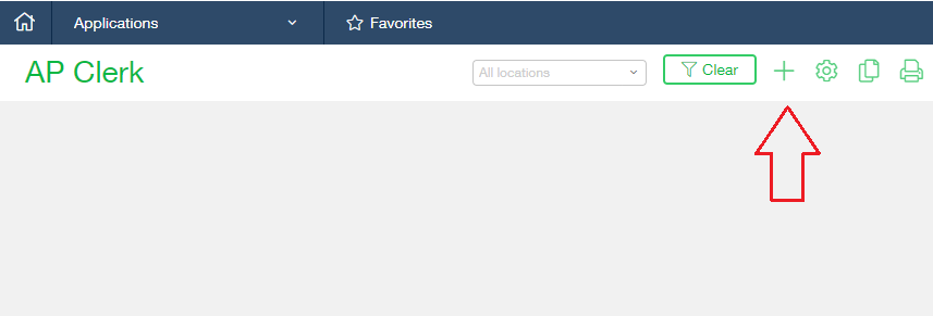
In order to add a new performance card to your dashboard navigate to the dashboard list screen found at Dashboards > All > Dashboards, locate the line item for the dashboard you wish to modify and click ‘View Components’. The dashboard will load. In the top right corner of the dashboard click the + mark to add a new component.

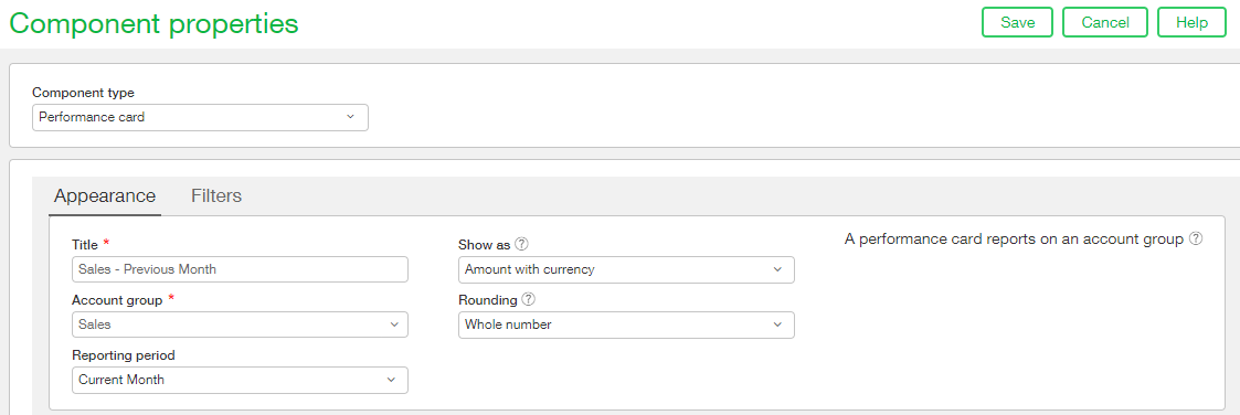
From the Component properties dropdown select ‘Performance card’ and you will be taken to the Appearance tab on the Component properties screen. In the title field enter a meaningful title for your performance card, our performance card will be a Sales comparison between the current month and the previous month so it is named ‘Sales – Previous Month’. From the account group dropdown ensure you select the correct group. If the group you require is not an option there then it most likely needs to be set up. Simply open another tab of Sage Intacct and navigate to General Ledger > All > Financial report structures > Account groups and set up the group there. Please note: The account group can be made up of a single GL account or multiple, depending on how you wish to report. Once the account group is set ensure you specify the Reporting period you wish to use, how you wish the amount to be displayed (amount or percentage) and how you wish it to be rounded.

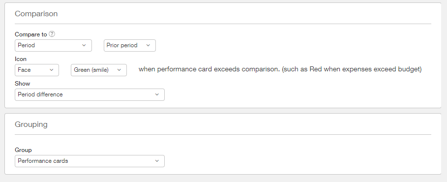
The lower portion of this screen is where you will specify the second set of data to which you will compare the first. In this Performance Card we will be comparing the current period with the previous period. There is a dropdown there to select the Icon you wish to have displayed on your performance card and how you wish to have the results displayed. The icon displayed varies based on the exceeds comparison. For example, if your actual expenses exceed the budget you will want to display a red sad face but if your monthly sales this month exceed your monthly sales last month, you will want to display a green smile. You can also choose whether to show the period difference or the percentage of change.
The grouping portion of the screen allows us to place components together into a grouping on the performance card. Having components grouped on the performance card makes for easier organization on screen.

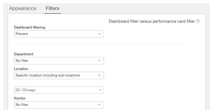
The Filters tab in the performance card setup allows you allow/disallow dashboard filtering and/or narrow the scope of the performance card value permanently. For example, if you only want the performance card to display the Sales values for one location, but you have the location dimension turned on for the dashboard you would set the Dashboard filtering to ‘Prevent’ and then select the location you wish to filter on manually on the filter tab.

Once you are satisfied with your performance card settings, click Save. Remember that these settings can be modified at any time if you wish to change them. Now preview your Dashboard in order to see your new performance card. Well done!
