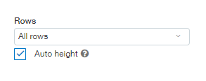
Last week we reviewed the Rows setting in the Component properties screen. This week we will continue on the path of Dashboard Customization and move down to the field below, Auto height.

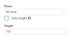
As you can see above the Auto height checkbox is checked. This means that the component will take up as much room as is required to display all the information it returns. When the checkmark is removed from this checkbox there is an additional field displayed where you can set the Component height manually in pixels.

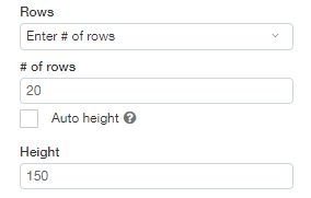
The Height field is like the Rows field in the way that it can be used to limit the amount of real estate taken up by the component. That’s where the similarities end. While the Rows field limits the number of data rows displayed, the Height field displays all the rows, but it limits how much data is visible at a time. When the component height is manually set the remainder of the data rows are visible by using a scroll bar. Using the example in the screenshot below our component will only show 20 rows but it will do so in a 150-pixel area. Note: the height specified is for the data area only, not including the title.

When Auto height is checked all the data returned will be displayed without the need to scroll. This is extremely useful in some situations but if our report is 500 rows long and we had our Row setting to ‘All Rows’ our dashboard might seem a little overwhelming. This is where it becomes useful to set a specific height. We can include all 500 rows in our dashboard component but only display 250 pixels worth using the following settings:
![]()
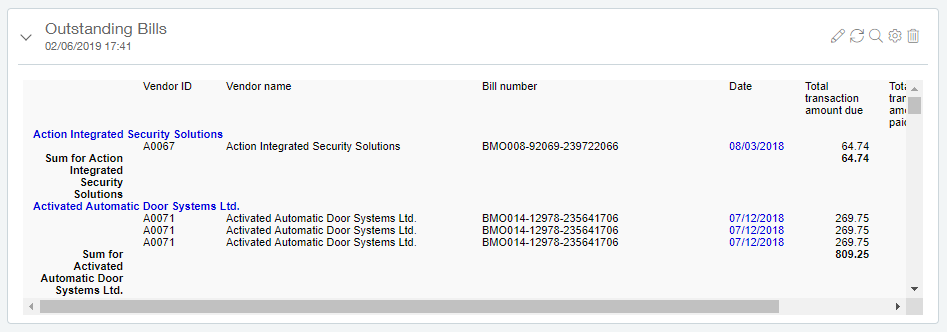
Below you can see the above settings in action. Since my memorized report happens to be quite wide not only did Sage Intacct add a vertical scroll bar but it also added a horizontal scroll bar when the Height was set to 250.

Join us next week as we finish up reviewing the settings available on the Component properties screen.