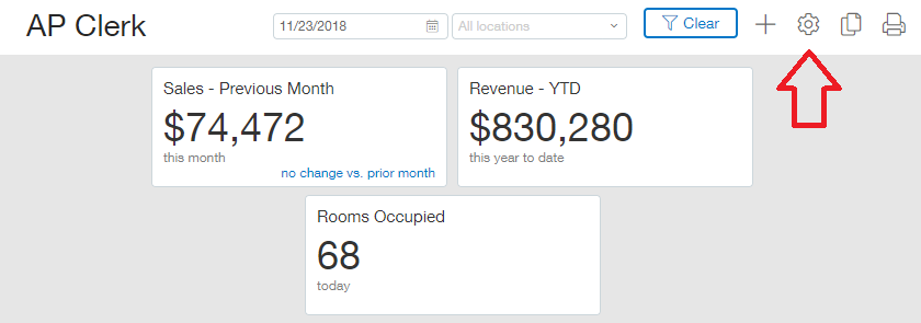
There are several settings within Sage Intacct in relation to the dashboards. These dashboard settings can be accessed and modified by clicking the gear in the top right corner of the dashboard you wish to modify.
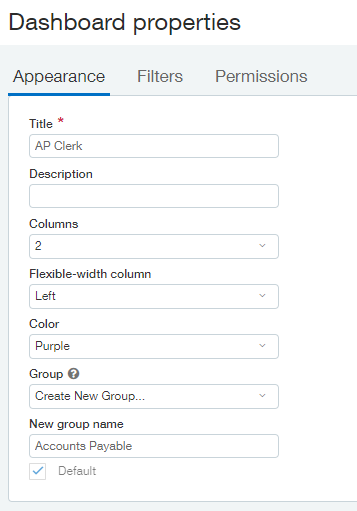
After the Dashboard Properties window opens you will immediately notice three tabs across the top: Appearance, Filters and Permissions. We will review the Appearance tab first.
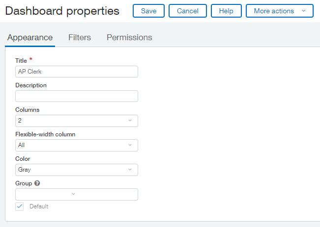
At the top of the Appearance tab is the Title of the Dashboard. This is a require value which was set when the dashboard was created but it can be changed at any time.
The Description is an optional field that is available to you. This field is useful in the event that the Title field doesn’t have enough room for you to accurately describe the purpose of your dashboard.
The Columns dropdown is where you specify how many columns you wish to have on your dashboard, either 1, 2 or 3. This value can be changed at any time if you wish to experiment with what your dashboard will look like with each setting.
The Flexible-width column dropdown is used to specify which columns, if any, can be dynamically sized based on the width of the elements on the dashboard. This is useful when you have wide components and want them to be able to be displayed properly. The available choices in this dropdown is dynamic depend on the number of columns selected in the dropdown above. When 3 columns are selected then the options in the Flexible-width column field are Left, Right, Middle & All. When 2 columns are selected then the options in the Flexible-width column field are Left, Right and All. If 1 column is selected then the Flexible-width column field dropdown will not even appear on the properties screen!
The Color field allows you to customize the color scheme of your dashboard either using the colours offered or by allowing you to select a custom colour. For example, a green color scheme will look like this:
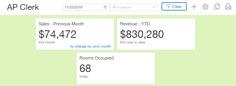
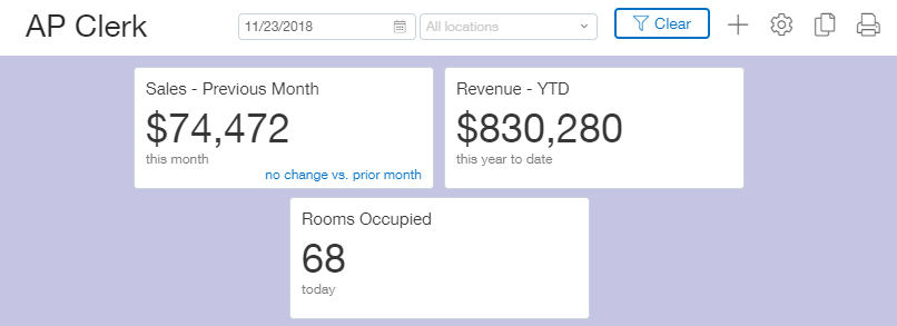
While a purple colour scheme will look like this:
The final setting on the Appearance tab of the Dashboard Properties window is the Group field. The group field allows you to group similar dashboards together on the dashboard menu. For example, we can make a grouped menu by first setting our group for the AP Clerk dashboard as ‘Accounts Payable’ as shown below:
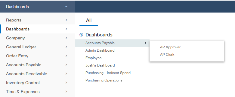
Then we will do the same for the AP Approver dashboard. After placing both those dashboards into a dashboard group when we look at the dashboard menu the two dashboards will be grouped together as shown below. Please note, a browser refresh (F5) should be done after a change to this setting in order to reload the menus.
